This zine brings attention to the type that we often overlook in everyday city life and exhibits how type is all around us. I captured street signs to road markings through close-up photography.
A6, 16 Pages:
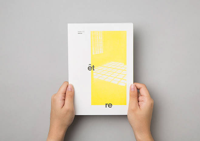
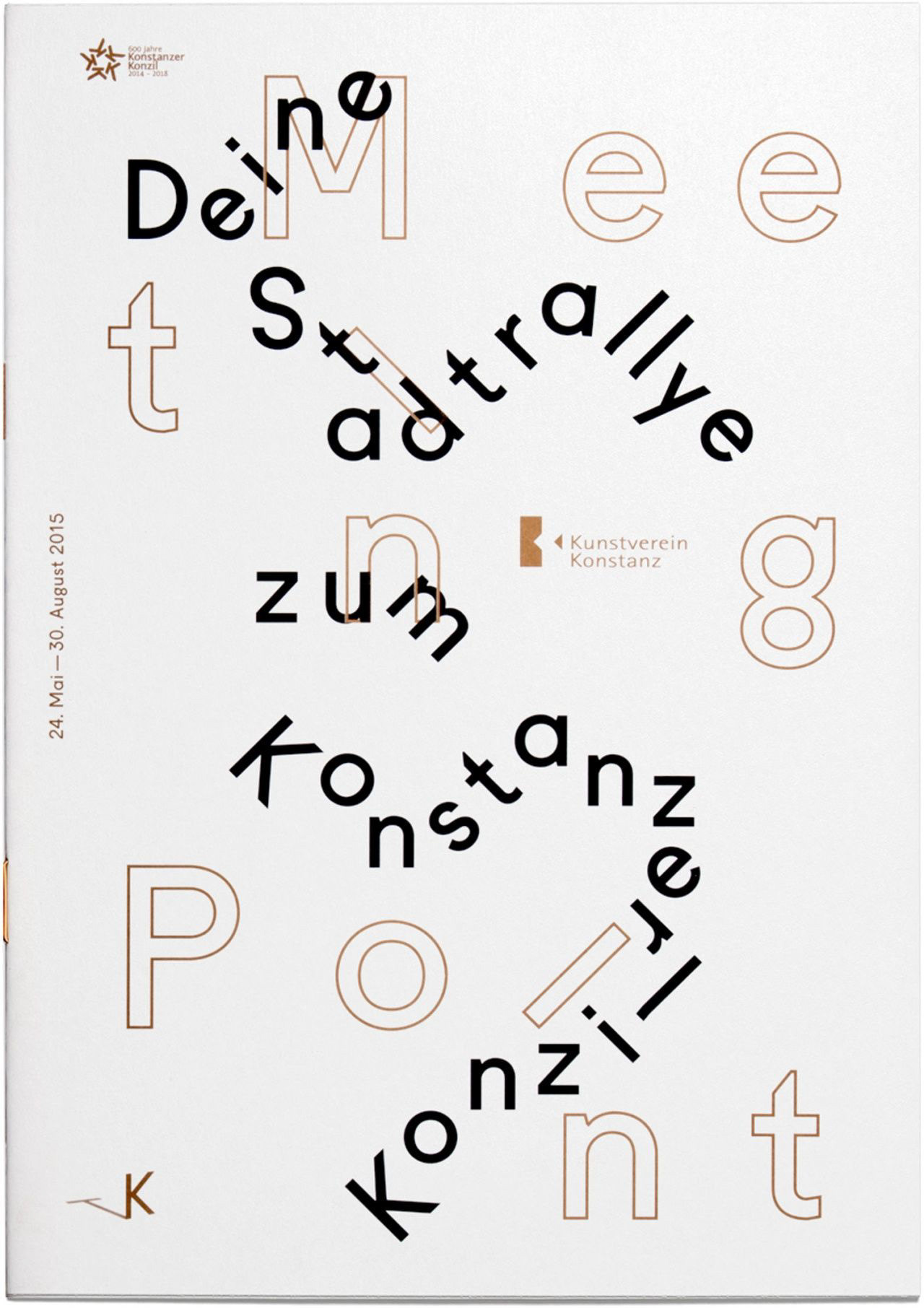
I was inspired by this Être publication that has type written off the edge of the images, extending the page. As well as the use of yellow that relates to street signs and brings a vibrancy to the mundane. Moreover, Meeting Point and Huck magazine use limited words and colours, yet the type is refined and arranged in a clever composition. This inspired me to use limited text, overlaying the stencil type and imagery.

Être publication, Qu’est-ce que c’est Agency

Meeting Point, Kunstverein Konstanz, Studio So

